
Harness introduced a Continuous Verification Dashboard, enabling architects and engineering managers to monitor deployment verifications in real-time, identify trends, and quickly pinpoint root causes of failures, enhancing the Continuous Delivery process without manual configuration.
Back in October last year, I published a blog around how Harness uses machine learning to auto-verify deployments by analyzing time-series metrics from APM solutions such as AppDynamics, New Relic, and Dynatrace, and also unstructured events from log analytics such as Splunk, Sumo Logic, and Elastic. At Harness, we call this feature Continuous Verification.
Feedback from customers was incredibly positive, as was the number of feature requests to enhance this unique capability.
One popular request was to have a single-pane-of-glass dashboard that summarized all deployment verifications over time. Architects and engineering managers were keen to identify at a glance whether most deployment verifications were succeeding or failing.
Why? Two-fold: so they could proactively manage trends of failure, as well as promote trends of deployment success, as their Continuous Delivery process matured.
It's a bit like having a dashboard that shows the winning streaks of all your favorite sports team and using it to understand who's playing well or sucking.
Harness Continuous Verification Dashboard
So that's exactly what we built our customers - a single-pane-of-glass timeline view for all their deployment verifications. Real-time analytics.

Mouse over any verification event, and Harness will show you the related service/artifact version, along with the deployment day and time:

Click on any verification event, and Harness will show you a summary of all verifications (performance/quality/security) that were executed by Harness during the deployment:
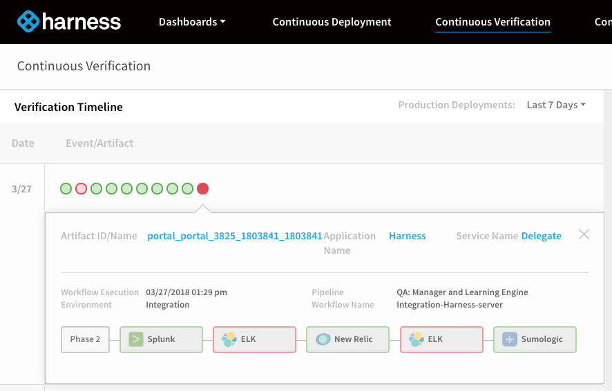
In the above example, the failed verification event represented 5 sub-verifications (Splunk, ELK, New Relic, ELK, and Sumo Logic), two of which, failed (denoted in red).
We can click on any one of these verification failures to understand what the business impact and root cause actually were:

In the example shown, the right detail-pane shows three new (high risk) exceptions that were identified by the Harness machine learning analyzes logs from ELK. Clicking on each red dot shows the complete stack trace and event description. We can see from the screenshot above a new NullPointerException was identified as a unique unknown event that has not been observed before.
So literally, in three simple clicks, customers can now identify a failed deployment, zoom in on which verification failed, and identified the root cause of the failure. All thanks to real-time analytics.
All of this insight was dynamically generated by real-time machine learning algorithms that were simply analyzing data from existing monitoring and log tools. No human configuration or thresholds were required.
Here's a quick video of our new Continuous Verification dashboard:

Today, Harness Continuous Verification supports:
- Shell Scripts
- HTTP/REST Assertions
- APM Tools - AppDynamics, New Relic, and Dynatrace
- Log Analytics Tools - Splunk, Sumo Logic, ELK, Logz.io
- CI Tools - Jenkins, Bamboo
In a few weeks, we'll have support for Datadog and Prometheus. If you want to give our Continous Verification a shot, sign up for your trial here.
Cheers,
Steve.
@BurtonSays

All this author’s posts
Harness delivers intelligent AI automation, so your team ships code faster, safer, and smarter.