Learn how we came up with a simple solution to tackle our wide array of product modules and personas at Harness.

TL;DR
Navigation is a critical aspect of any system, whether it's a website, application, or software platform. Its importance stems from several key factors that directly impact user experience, efficiency, and overall satisfaction.
Navigation is a critical aspect of any system, whether it's a website, application, or software platform. Its importance stems from several key factors that directly impact user experience, efficiency, and overall satisfaction.
The Harness navigation design has been evolving quickly in the last couple of years to support our business goals; maintain competitive edge; adapt to user needs and changing workflows; accommodate product growth and integrations; and improve usability and efficiency.
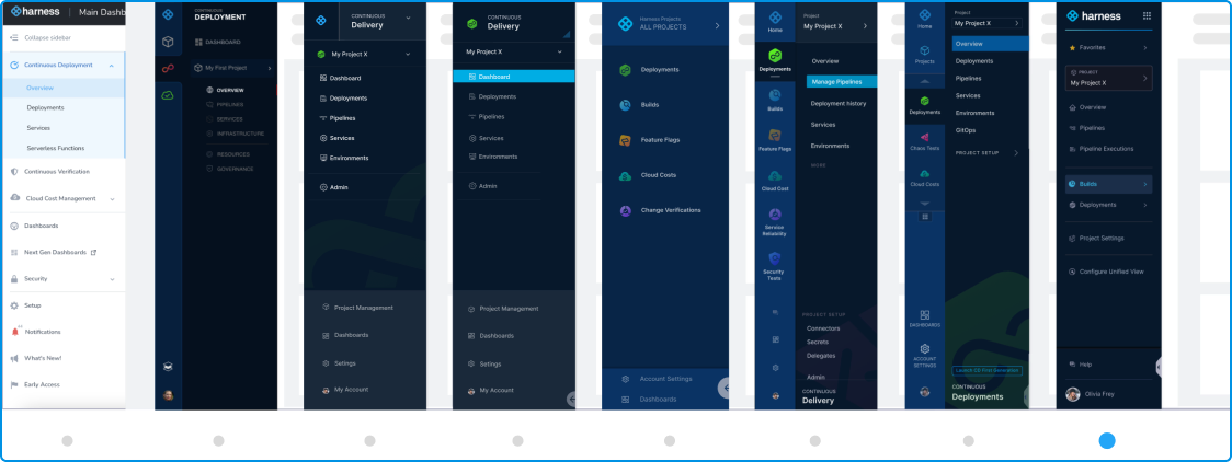
Here’s a glance of how we came up with our Harness navigation design.
1. Supporting the User Landscape
Software delivery tools are typically used by a range of professionals—developers, testers, DevOps engineers, and project managers, each with distinct requirements. That is why extensive research to learn about our typical user personas and their user journeys is extremely crucial.
Unlike other companies who focus just in 1or 2 software delivery tools, Harness, being a house of +15 modules product modules that are carefully integrated in one platform, has a lot more user personas to consider.

2. Prioritizing a unified experience
When dealing with a suite of software delivery tool with so many different personas, a level of consistency in navigation is key to providing a seamless experience.
Given Harness has way to many different module combinations to use, the possibilities are endless.
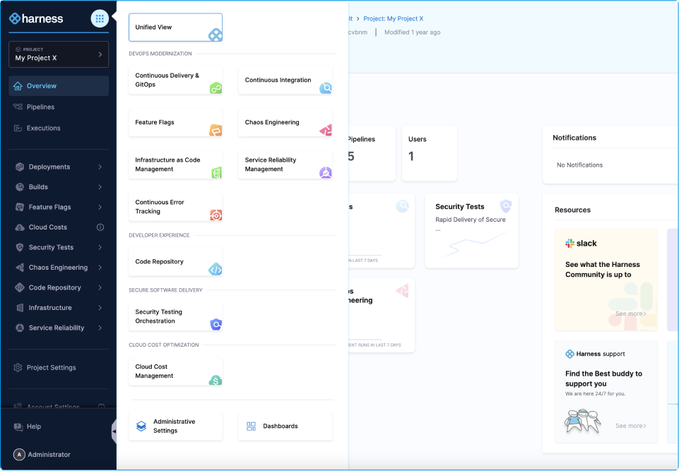
Knowing this pain point, we designed the navigation view selection panel so users get to choose the Harness experience that works for them. In essence, we address different user person and needs with focus on those who:
- Work with 1 specific product module view and don’t care about anything else
- Work with multiple product modules
- Focus in general administrative work
- Care about reporting and metrics only
3. Implementing for Hierarchy and Contextual Navigation in a Complex Arena
Effective navigation must cater to the complexity of software delivery application and processes by organizing information logically and contextually.
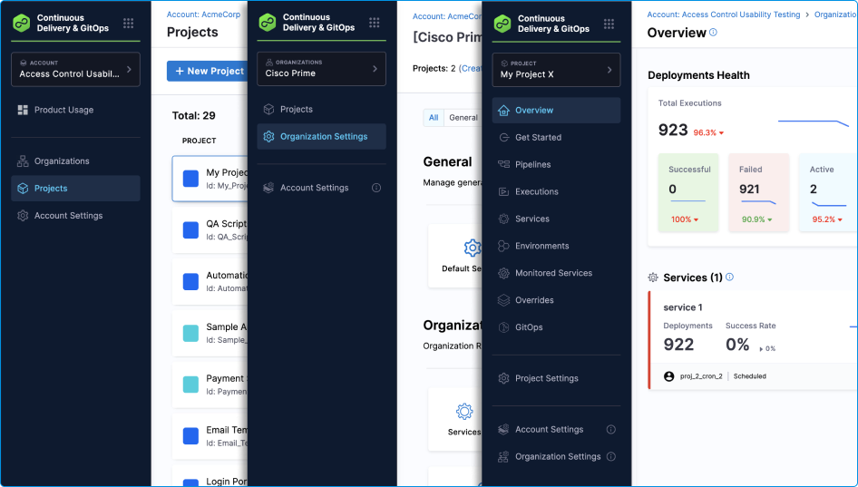
At Harness, we have 3 hierarchy levels (or scopes) known as: Account, Organizations, and Projects, where users can manage certain resources across different scopes based on their business objective and access control settings.

This type of hierarchy sounds complex and headache-inducing, but it allows users for certain Projects to work independently without too much reliance on approval from administrators; thus promoting a safe bubble for innovation and experimentation.
To tackle this challenge, the scope selector was born to allow users to traverse across the Harness hierarchy.
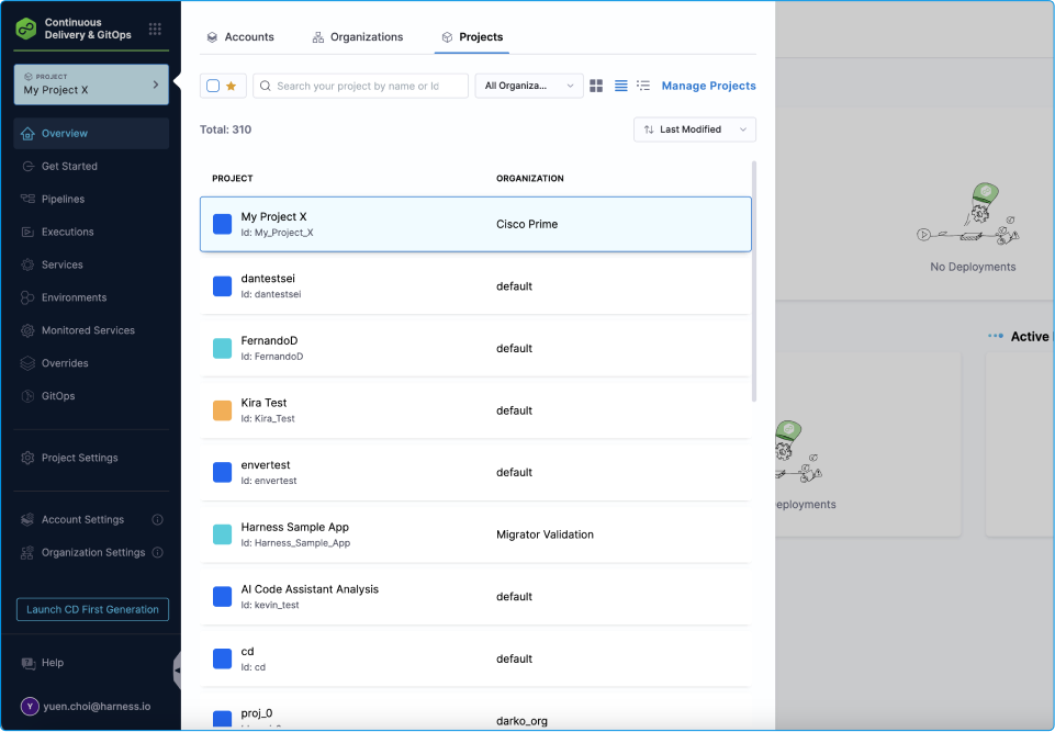
We decided to enhance our original project selector by allowing users to select which scope they want to go to manage specific resources. This allows the users to stay in context.
4. Optimizing for Efficiency and Speed
Speed and efficiency are critical in software delivery. Navigation should facilitate quick access to frequently used features and minimize unnecessary steps (or clicks if necessary).
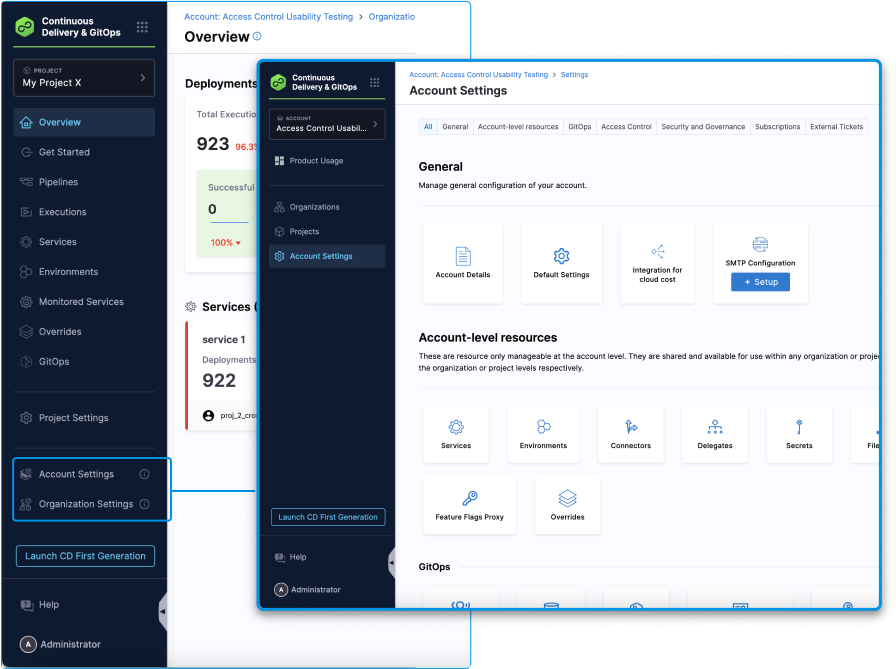
5. Ensuring Flexibility and Customization
Different users have different needs and preferences. Navigation design should accommodate this by offering flexibility and customization options. We put in place a couple of ways people could customize their navigation experience.

6. Continuously testing and iterating
Navigation design is not a one-time task but an ongoing process that requires regular testing and refinement through usability testing and monitoring analytics.
Navigating Effective Design
Designing effective navigation for a diverse suite of software delivery tools is a challenging but essential task. By understanding user needs; prioritizing consistency with thought to your product hierarchy; optimizing for efficiency; and incorporating options such as search and filtering, you can create a unique navigation experience specific to your product that enhances productivity and user satisfaction.
Flexibility and continuous improvement further ensure that the navigation remains relevant and effective as the software landscape evolves.
Experience the Harness Navigation for yourself